Real-Time Time Series Chart With Kafka and Socket.io
Our team at ThoughtWorks, E4R (Engineering for Research) has been working on Epirust- an open-source agent-based modeling solution for epidemiological simulations. In the midst of this pandemic, it is crucial for epidemiologists to make quick and effective decisions that would help control the spread of COVID. Epirust is an attempt to simulate a region, say India with its population as agents and visualize the effect of interventions such as vaccines, the lockdown, and an increase in the number of hospitals on an agent’s daily routine. To know more about the motivations behind this project, head over to the Epirust wiki.
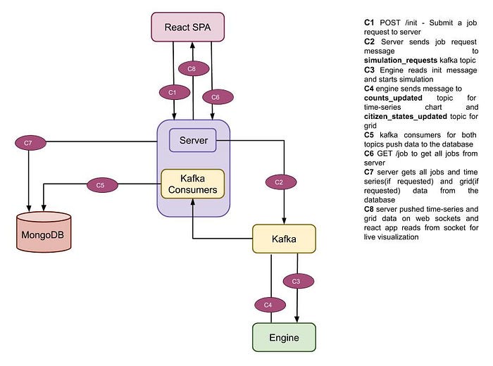
As part of the E4R team, I had the opportunity to work on the visualizations for this project. In this post, I’ll walk you through the architecture of Epirust and the thought process behind using Kafka and web sockets for building the following real-time time series visualization.
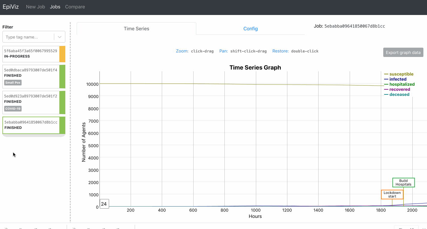
The data presented in the visualization is received from the backend engine(written in Rust). The engine encapsulates the core logic of generating counts of susceptible, infected, hospitalized, recovered, and deceased agents per hour. These counts are based on a certain input configuration eg. population size, transport percentage, working population percentage, and disease dynamics for COVID.
Let’s break this problem into the following 3 parts:
- Streaming data from the backend
- API to consume the stream on the frontend
- Charting library to visualize this data
Streaming data from the backend
The Rust engine generates a number of agents infected per hour. We wanted to visualize the changing curve for each passing hour of the simulation. Here’s a peek into the JSON received from the engine:
{
  hour: 1,
  infected_std: 1,
  susceptible_std: 100,
  hospitalized_std: 10,
  recovered_std: 2,
  deceased_std: 0,
}
We need a platform to stream these updated counts for each hour in real-time so that the frontend can react by plotting the curve on the graph for every hour. If we think in terms of events, each count generated by the simulation model is an event. Once this event is published, interested parties can subscribe to it and visualize it in their own ways. This is a typical use case of the pub/sub-model.
Kafka is a popular event streaming platform. It’s a distributed platform and hence highly scalable and available. Since the simulations run based on the input configuration, we had certain use cases where we would want the simulation to accept configurations for a city’s climate, population, transport percentage, etc., and scale the model to run on a country level, hence Kafka fit the bill perfectly.

We wrote a Kafka Producer in Rust that would push the count for each hour to a counts_updated topic. The counts_updated topic was further subscribed by the Kafka Consumer on the server. Our idea of having a server component between the Rust engine and the frontend was so that we could persist the simulation data generated for a particular input. eg. We could persist simulation results for 1000 hours having 3000 agents and compare it with 2000 hours having1000 agents.
API to consume data on frontend
We need the frontend to receive the hour messages in real-time. If the frontend were to make an HTTP request to receive the updated counts, it would have to poll for changes making it very difficult for the frontend to know the frequency of polling for messages. Furthermore, this would not be real-time, some delay would have to be factored in. Since we understood that HTTP wouldn’t work in this scenario, we started looking at other means of pushing messages to the client for updates.
Web sockets allow to the establishment of a connection between a web browser and a server. Messages can be relayed in real-time by the server to the client using this connection. For this purpose, we used the library socket.io.
Socket.io has two components:
- A server that integrates with NodeJS
- A client library that loads messages on the browser side
On consuming the updated counts from the Kafka Consumer, an event epidemicStats with updated counts is emitted from the server on the socket.
socket.emit('epidemicStats', {
  infected_std: 3,
  susceptible_std: 200,
  hospitalized_std: 5,
  recovered_std: 4,
  deceased_std: 0,
});
This event would then be received by the frontend React app listening on the socket for messages. We use the socket.io-client library for this purpose. If the simulation ends, then a message denoting the same is sent.
socket.on('epidemicStats', function (messageRaw) {
    const message = messageRaw;

   if ("simulation_ended" in message) {
        simulationEndedTemp = true;
        socket.close();
    }
    else {
        const { hour,
            susceptible, susceptible_std,
            infected, infected_std,
            hospitalized, hospitalized_std,
            recovered, recovered_std,
            deceased, deceased_std } = message;

        const perHourStats = [hour,
            susceptible, susceptible_std,
            infected, infected_std,
            hospitalized, hospitalized_std,
            recovered, recovered_std,
            deceased, deceased_std
        ];

        buff.push(perHourStats);
Charting library to visualize real-time graphs
The time-series graph would be updated frequently, so we needed a library that could accommodate the changes quickly without breaking the UI. After a performance comparison between chart.js, vega-lite, and dygraphs, we realized dygraphs to be the most performant.
Here’s how you create your multiline line chart using dygraphs:
let options = {
    legend: 'always',
    animatedZooms: true,
    title: 'Time Series Graph',
    ylabel: 'Number of Agents',
    xlabel: 'Hours',
    showRoller: true,
    errorBars: true,
    rollPeriod: 24
}
const visualisationDiv = document.getElementById("vis");
const graphInstance = new Dygraph(visualisationDiv, convertToCsv(buff), options);
Dygraphs charts can handle large datasets without getting bogged down. The chart is also very interactive, giving us an easy option to pan and zoom. It accepts a rollPeriod based on which it averages out the curve. Since the data we generated was on an hourly basis, we averaged it out to 24 hours.
Conclusion
We discussed the Rust engine that generates counts of agents that are infected, diseased, hospitalized, etc., and pushes it onto Kafka where a Kafka Consumer on the server reads them and puts them onto the web sockets. This data is received by a React app listening on the socket to plot a line chart that updates in real-time.
The following is an architecture diagram of Epirust. I hope this helps you get the big picture.
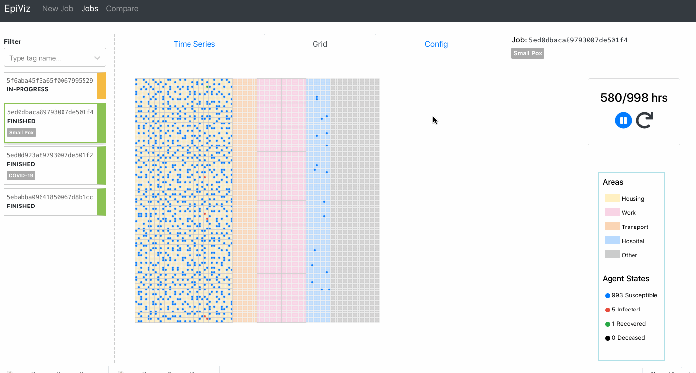
I’m going to be coming up with part 2 for this series where I’ll talk about the performance comparisons we did among the charting libraries. In the later stages of this project, we also built a grid visualization to track the movements of the agents.
All the code snippets are taken from the open-source project Epirust. Feel free to explore the project and read more about agent-based modeling. Watch out for the subsequent parts of this series.
Reach out for any feedback and how you think we could have done this better. Happy to hear from you!
Check out the Epirust project-https://github.com/thoughtworks/epirust